Perusing Wolfeboro Websites
If it ain't broke breaking it is just one vote away José
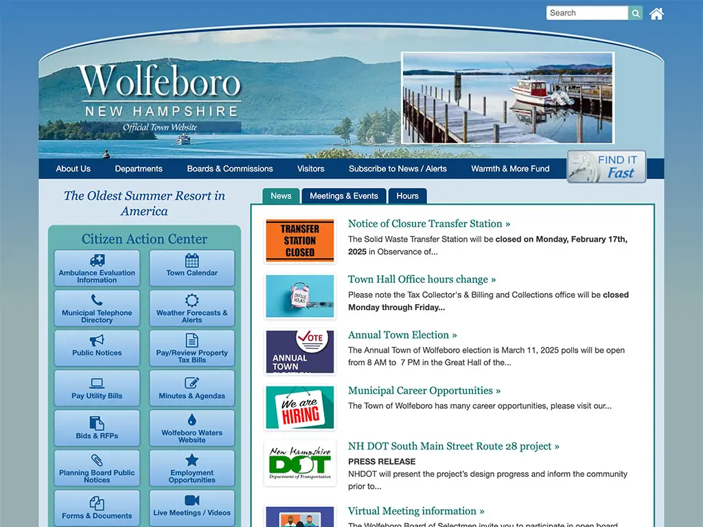
Wolfeboro’s Official Town Website won’t win any design awards. It is, however, functional and navigable. What more can a visitor hope for? Most of the time functional and navigable are satisfactory, even desirable. Whether you’re fixing to pay a bill, download a document or find a link for a related town office the current site serves the purpose. Can it use a style makeover that more effectively communicates Wolfeboro’s historical appeal deserving of the slogan, “The Oldest Summer Resort…”? Sure! Will such a style makeover positively alter one’s disposition when meeting their obligation to pay a utility bill? Not likely. The old adage If it ain’t broke breaking it is just one vote away José applies.
Let’s have a look at some popular Wolfeboro businesses’ websites. What’s good and what can be improved? We can start with the new kid in town. Harmony Coffee in Wolfeboro opened its doors in 2021. They have themselves a pretty nice DIY Wix site. It’s “free” to create a Wix site, while monthly hosting fees range from $17 to $36. Somebody knows their way around the Wix features. The site is fine. It’s got some nice touches with the parallax image features and a clean minimal design. A couple of minor drawbacks: 1. The footer says, “©2023 by Thyme. Proudly created with Wix.com.” 2. The font-size for the text is too small in places and should have a heavier weight to make it more readable. Similar issues for the mobile version of the site. At least all three of their social media links work. To their credit they also appear to be following good SEO practices having established a Google My Business page and gotten nearly 100 positive reviews.
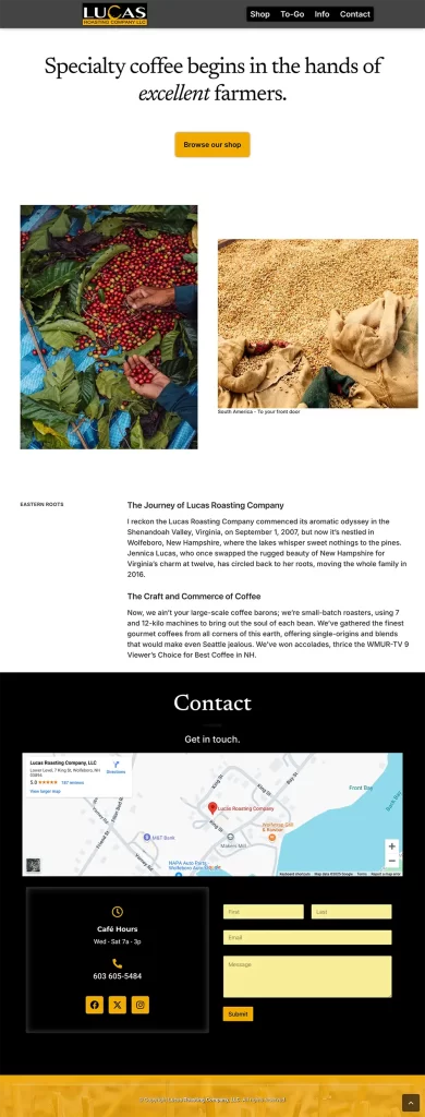
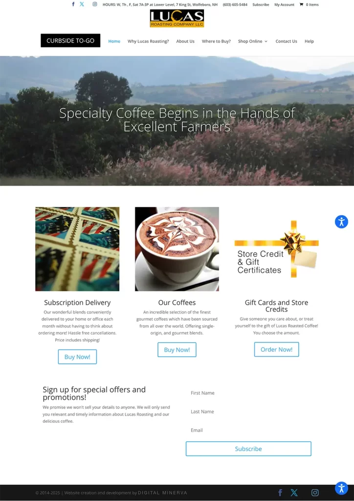
Lucas Roasting Company LLC has a WordPress site that could use some tender loving care. It’s design is outdated. While a user experience (UX) should focus on the functional regarding a local government site, communicating a small business’s brand with a signature design is more important due in no small part to free market competition. WordPress has modern templates to choose from. Giving their site a facelift doesn’t have to break the bank. The landing page image slider is a common feature, if over done. I should know, it’s a feature on several sites I’ve deployed. Four of the five images used by Lucas are generic and fail to push the Lucas brand. There is a single image that features, Troy, one of the owners. The navbar at the top of the site is cluttered with too much info crammed into a small space. The info could be better organized and pulled into a footer that appears on each page of the site. The font-size and font-weight for the text, like Harmony Coffee’s, is too small and light weight. It has the effect of making a visitor not want to bother reading it. Their Shop Online store has a lot going on, much of it unrelated to the business of roasting coffee. For example, Lucas sells stickers and magnets, jams and jellies, food items, custom mugs, accessories, commercial equipment, clothing and apparel… A major overhaul of their site might include de-cluttering and narrowing the focus in answer to the question: What is your most important product? If it’s roasted coffee beans, for which Lucas has received very positive reviews, then the website would better serve their business by re-asserting the focus on their roasts. They have a Curbside To-Go link to a Square site, which seems to have been set up in response to the pandemic, that could be improved by making sure that anywhere there are supposed to be images, actual images appear instead of placeholders. Alas, I did submit a mock-up to Troy and Jennica via their website contact form for their perusal. Whether they choose to hire me, another developer or make the modifications themselves, they roast an excellent bean!
Lucas Roasting - Current Site
Lucas - Mock-up